Thursday, 8 December 2016
Wednesday, 7 December 2016
Friday, 2 December 2016
Monday, 28 November 2016
Thursday, 17 November 2016
(working progress) contents page
today i complete my contents page however, i haven't been taken any images therefore to completed my contents page i need to photograph models. if i do this then the contents page would be completed and i can move onto the double page spread.
Wednesday, 16 November 2016
Today I started doing my final contents page which would look like this. as its working progress i would change thing also the background is not green i made it green so i can see white writing.
i need to add images to complete my contents page
i learnt how to use the grid to make my work more organised.
i need to add images to complete my contents page
i learnt how to use the grid to make my work more organised.
Monday, 14 November 2016
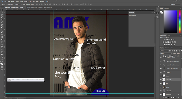
today i have complete my mock up front cover. this would give me an idea of what i would like to do in my actrall magazine. next lesson i will have to complete my contents and double page mock ups so i could know what i am doing and i can use it as an example and know what looks good and i can change it around if i think it doesn't look good.
Friday, 11 November 2016
my location
Wednesday, 9 November 2016
working progress front cover plan
this is my front cover plan. i have my original logo which is "AMK" and i think that it looks very good and i think that its easy to remember however, it would be a good idea to come up with an idea of what "AMK" can stand for.
media pitch
i will change my target audience to people aged 14-24 as most teenagers wont spend money on magazines adults will as they work.
Thursday, 20 October 2016
Thursday, 13 October 2016
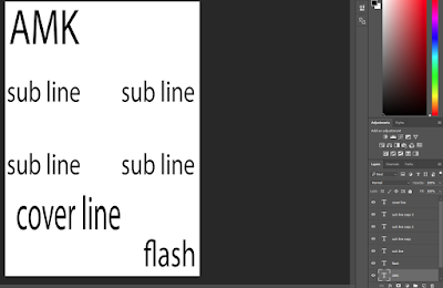
front cover college magazine
To improve I should change the placings of the sublines because they look cramped up and i should make the headline bigger to make it stand out more.
Wednesday, 12 October 2016
college magazine contents page
Monday, 10 October 2016
Wednesday, 5 October 2016
Sunday, 2 October 2016
content page
- one page (pages were ripped out)
- one column
- the personas clothing is different
- page numbers to help find what people need
- a picture of the artist
Friday, 30 September 2016
- results day
- key dates
- trip info/ repeat journalism
- student accomplishments
- celebrity secrets
- clubs/ activities
- competition
- interview with/ staff/ students
- preliminary task
- college magazine
- front cover
- contents page
Music magazine has various of different aspects. For example on the college magazine the persona is happy where as on a music magazine it will be more serious. However there are similarities as well for example they both have a cover line also they have the three colour rule.
Thursday, 29 September 2016
double page spread
- In the beginning it was introduced with a fact
- They talk very formal and their target audience is 23-34
- They layout is very format
- The camera angle is two shot which is two people, close up shot
Wednesday, 28 September 2016
content page
- There are two pages
- some of them
- There are (6) columns to separate each section (3)
- page numbers to help people find what they need
- also pictures to show what artist are included in the magazine most of them were mid long shot or full body shot
- It makes the magazine look very professional
clash title page
- Face shot
- There's an alternative genre: hipster and retro
- body language: relaxed
- colour used: different colours used to make it stand out
- price and bar code
Monday, 26 September 2016
Class analysis of Usher "vibe" mag
Image:
usher: mid long shot (mls)
aeroplane in background plot/engineering clothing.
Box-fresh white t-shirt tags
aviators shades.........
"top gun" - classic US iconic heathrob
lighting: high key lighting- emphasis star equality.
runaway/airtrip
colour scheme blue/yellow/black
genre:
expensive accessories connote R and B
page layout:
masthead:VIBE
convention to place star in the front of masthead
vibe is well establish
usher has dominance
san-serif constant
cover lines:
what else is in mag
skyline:
names of artist
main cover line:
puff
anchors picture
large
first person language
lower case to reinforce his brand
Friday, 23 September 2016
I have decided the genre of my magazine will be hip-hop. Because I listen to hip-hop all the time and I enjoy listening it. Hip-hop started in 1970s and since then it has changed and new people joined and improve it and made it more popular. It first started in New York City. Hip-hop is defined with four key elements rapping, DJing, graffiti writing and beatboxing which influenced different people with talent to get together and make hip-hop songs. they make sure that their logo is represented in a large font. Hip Hop weekly is the first band only weekly celebrity magazine for Hip Hop their target audience is 18-34 year old. Hip-Hop get over 800,000 viewers every week and they are top 15 magazine in 2007. Vibe has full service video capabilities led by experienced broadcasters team.
VIBE https://www.scribd.com/doc/112702966/2013-VIBE-Media-Kit
and
Hip-Hop http://www.hiphopweekly.com/advertise/
VIBE https://www.scribd.com/doc/112702966/2013-VIBE-Media-Kit
and
Hip-Hop http://www.hiphopweekly.com/advertise/
Thursday, 22 September 2016
Hello. My name is Murat. I wanted to study media because I do Photography and they are related. this would help as they are both related and i can use my photography skills to make my media work better and by improving it i will be getting better grades for both subjects. i also chose graphics which is related to both of these subjects which would help me when doing my work as i can apply my knowledge/skill from each subject and make my work better.
Wednesday, 21 September 2016
Subscribe to:
Comments (Atom)


